PetMatch
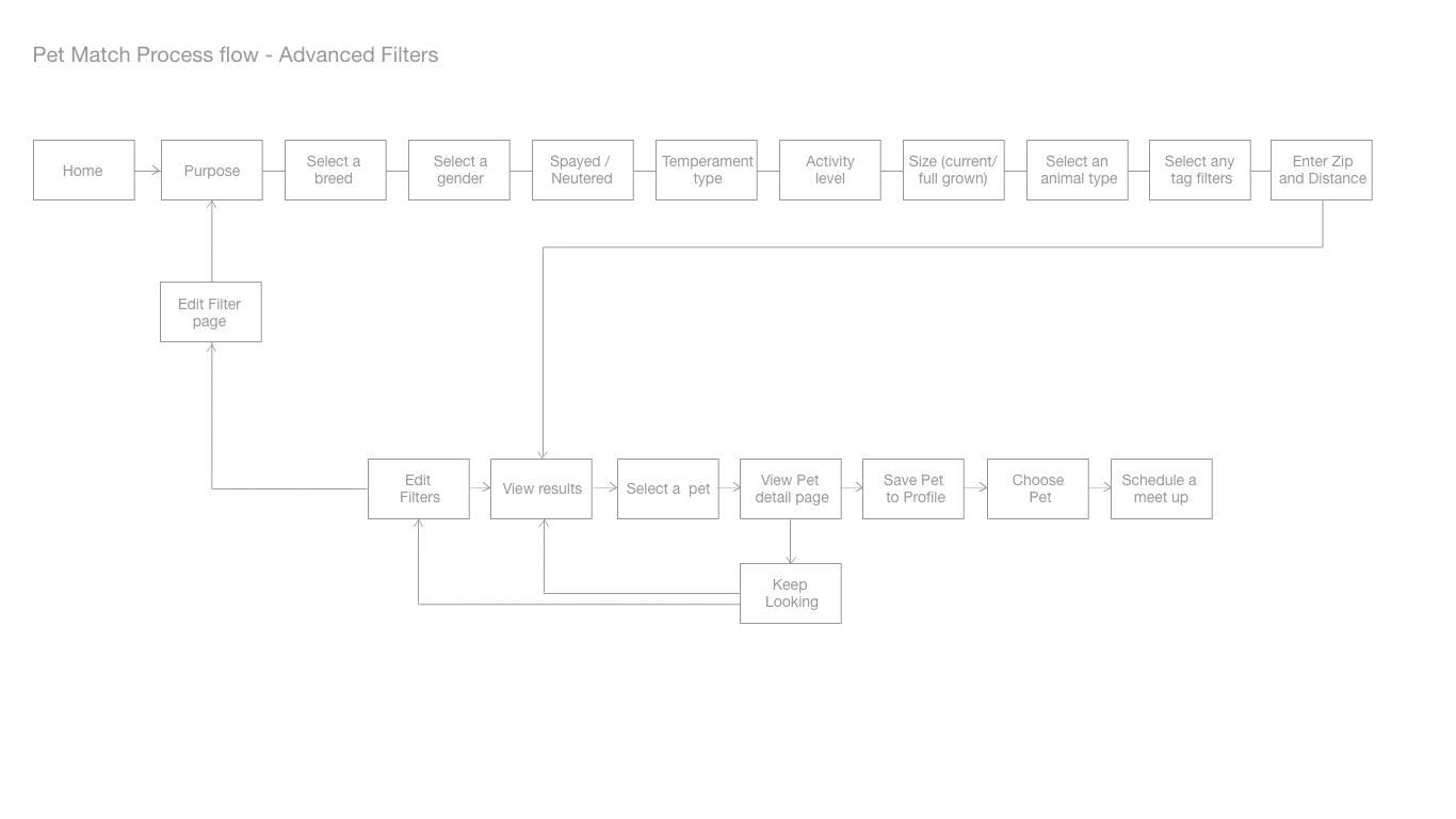
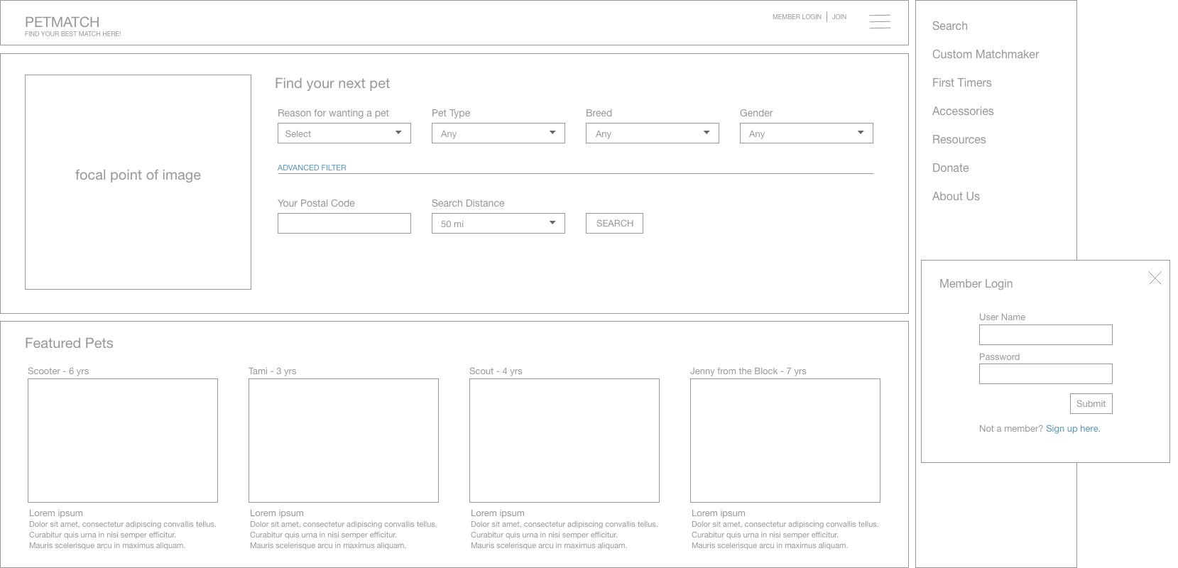
A design for an application that matches pets in need of homes with people wanting pets. Taking into consideration how pets will fit in with the lifestyle of the new owner and home. Deliverables where included process flows, digital sketches, wireframes, hi-fidelity mock-ups and paper notes.
Considerations
- What kind of information will be needed?
- Does every kind of user know what pet they are looking for?
- Who are your user types or Personas?
- Those that know what they want and want to see if available
- Those that don't know what they want, but are hoping to find something
- Those that have an idea but are not experts and would appreciate a little help
Answers to questions needed
- How often are they home?
- What about their dwelling, is it fit for certain types and not other types of animals?
- Do they do a lot of traveling? Some animals and breeds do better with that than others.
- Do they need a high, low, or mid level maintenance animal?
- Do they need a high, low, or mid energy or interactive level in an animal?
- Do they have any preference or not preferred pet type?
Filtering and tagging
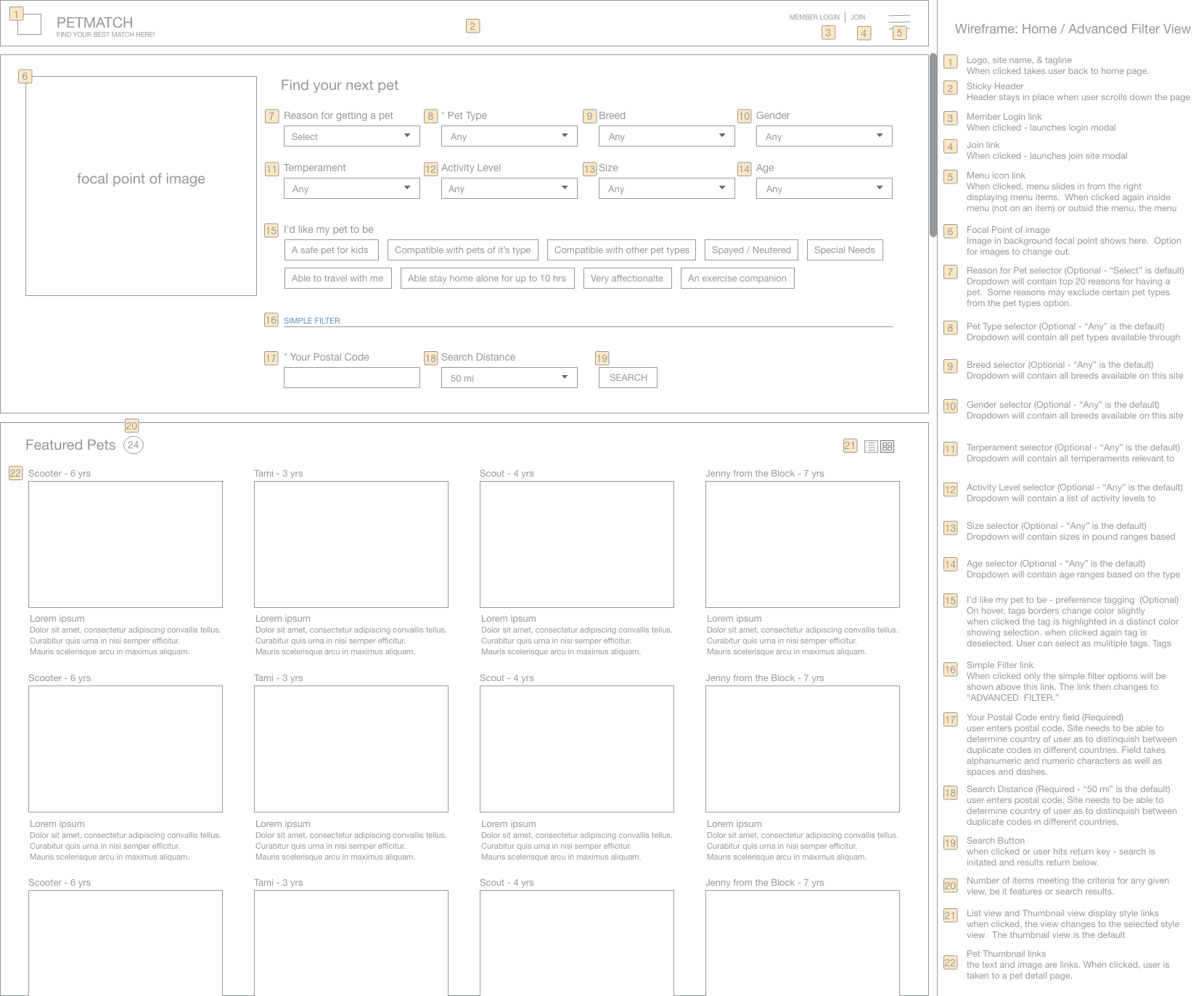
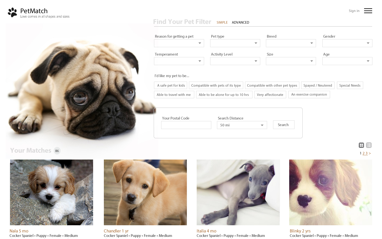
- I created a list for filtering that could provide options.
- Tagging was added so a user could select multiples options that applied to their situation.
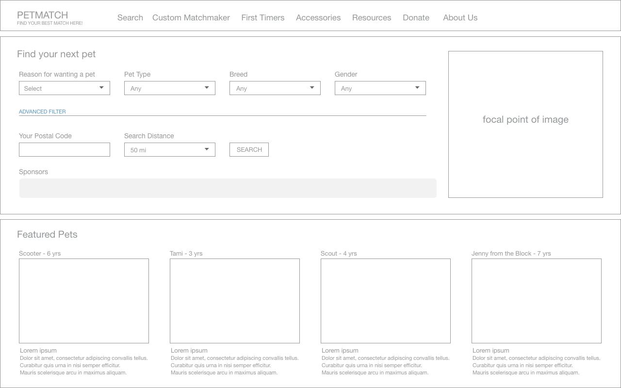
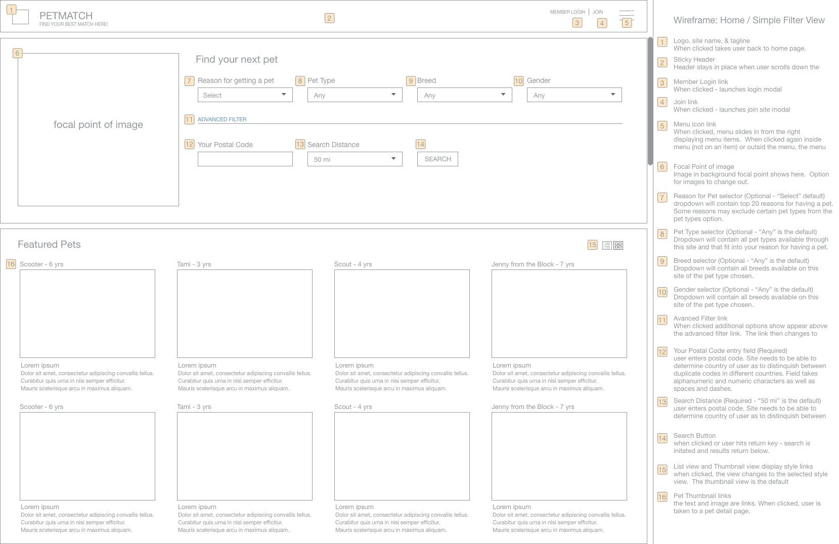
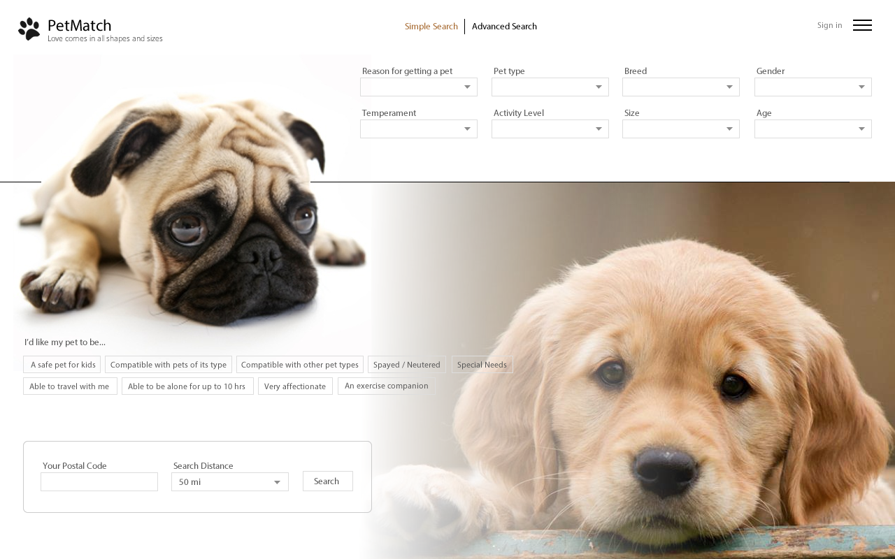
- Simple and advanced filter options were included in order to guard against too much crowding on the screen and to give each persona the option to effectively take charge, Each user type can choose the option that is best for their situation.
- Those that need more guidance may choose the advanced search, those who need less the simple search, and those who truly want it their way can choose advance and just fill out what they want to excluding the location postal code, and they are on their way to really great refined options.
Considered user needs
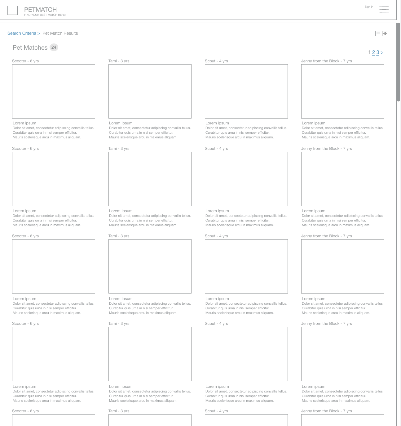
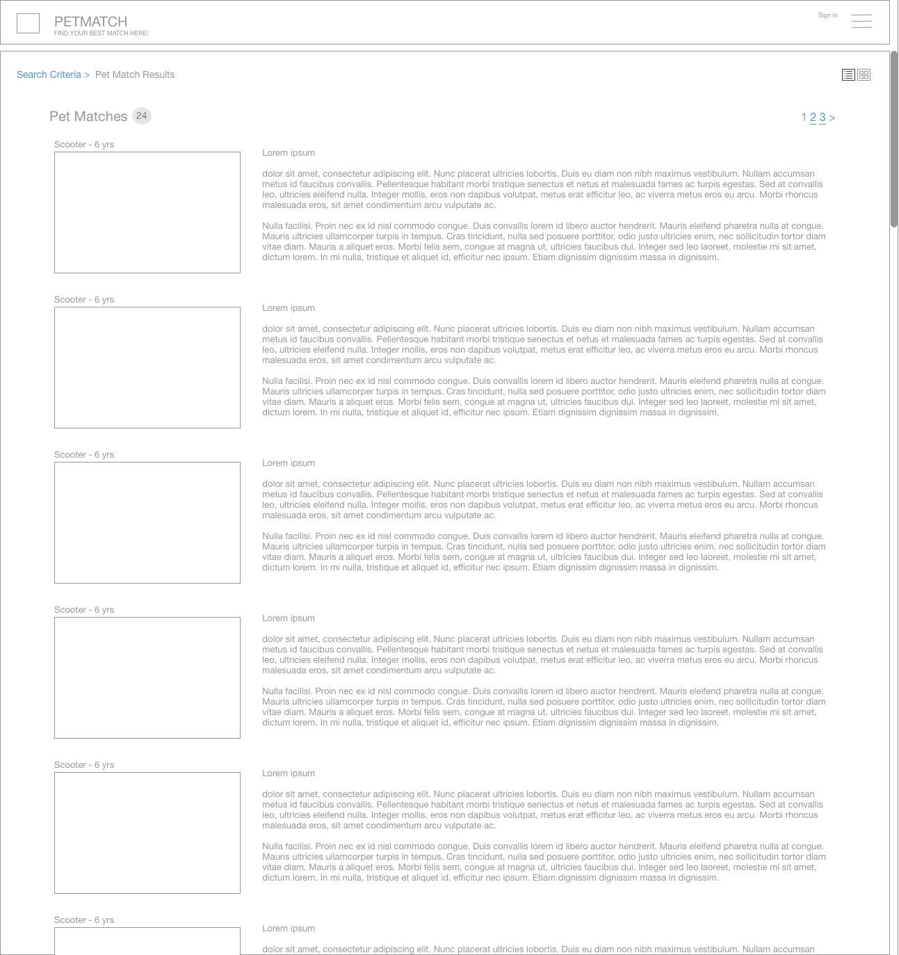
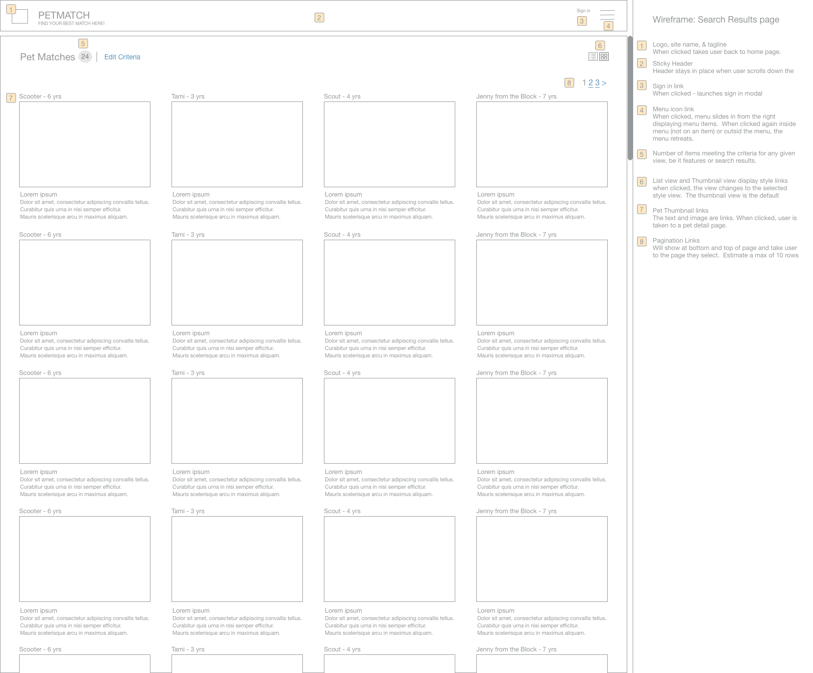
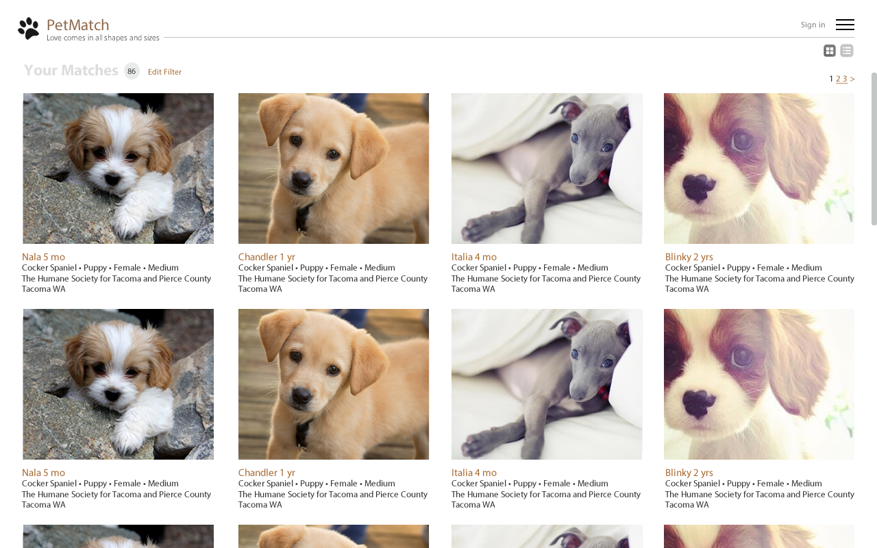
- to have list and or thumbnail views
- Pagination for long pages with an estimate of ten rows before pagination occurs
- The need for the user to search and go to an uncluttered page with just those options available (results page)
- To know the a total number of results available on results pages and finding it useful
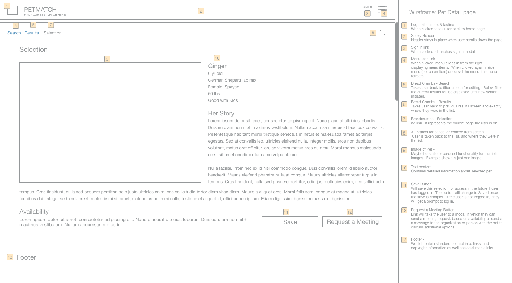
- To go back and adjust their filter criteria at any point in the process
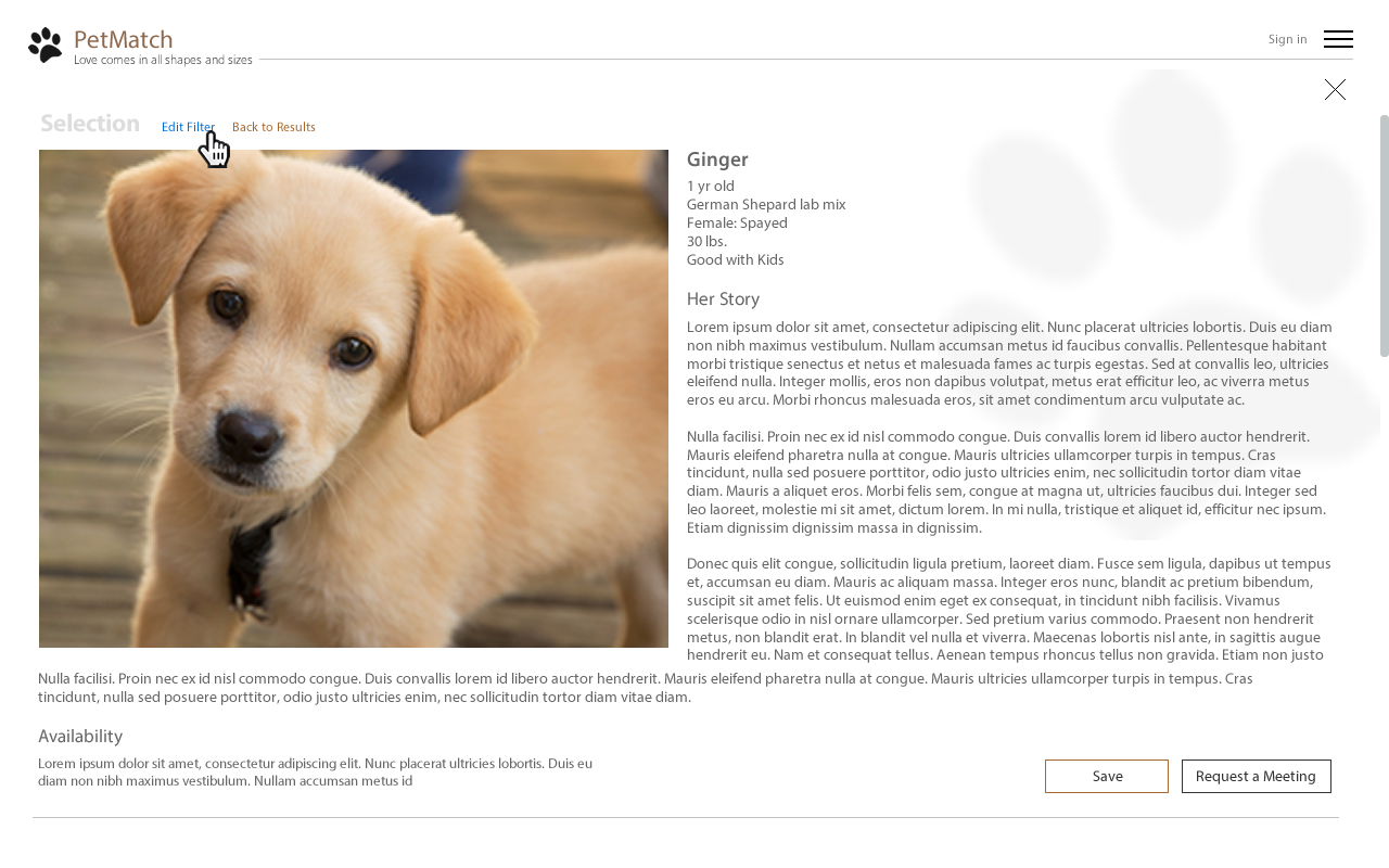
- To be able to go back to the results page easily and in two ways, when on the pet detail page
- The ability to easily save and return to a pet profile or set up a meeting request with the current guardians of the pet
- Helpful links in the menu and the option for the user to sign in or join via the sign in modal
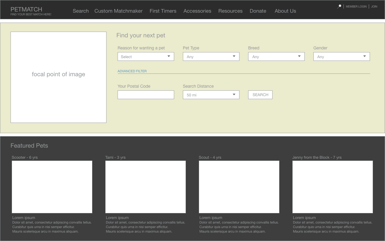
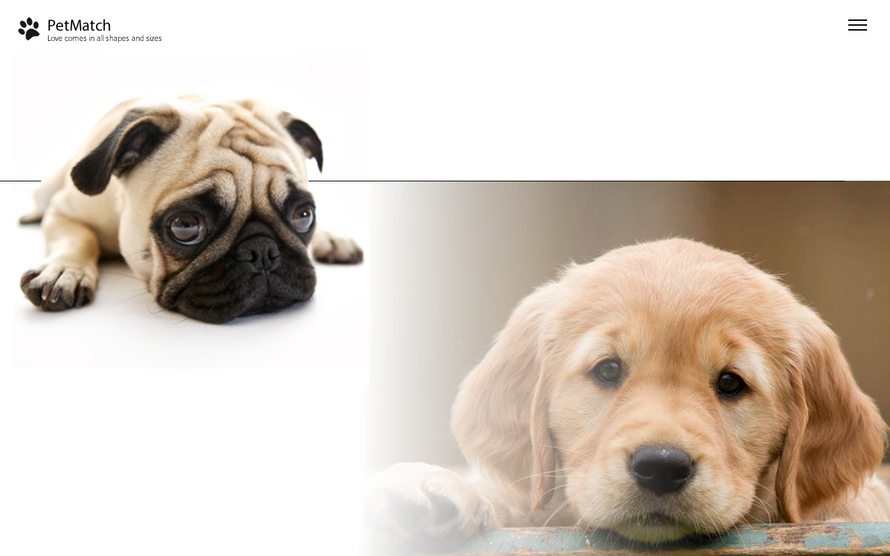
The home screen in the high fidelity mock-ups is designed with motion in mind
- The page as it appears upon entering is the only time that motion will happen.
- The homepage is designed to be very clean to start
- Slowly the simple and advanced filter options are designed to appear gradually above the line.
- The sign up link is designed to appear in the same manner.
- Once the user clicks on simple filter or advanced filter, the toggle will show the chosen item by turning the text color to black.
- Next the pivots rise to the top of the page. As that occurs, the components required for either the simple or complex filter will appear on the page guiding the user through experience they've chosen.
- The user has the option to switch to another filter type whenever they want.
- After the user clicks search, the results page loads, which upon selection of a pet, the user is taken to a pet detail page. Here the user can save this pet, send an appointment request, go back to the list, or edit their filter criteria.

